Here are 30 of the worst sites bandwidth can buy.
Warning, be prepared to regret clicking this link! Seriously, epileptics beware! I’m not quite sure what was going though their minds when they thought this was a good idea.
http://www.paperrad.org/

http://www.miauk.com/

http://www.evangelcathedral.net/welcome.htm

You may need to take motion sickness medication to view the next site. I kept asking myself “Is THIS what Jesus would do?”
http://www.dokimos.org/ajff/

This site is actually amazing, there are no other words for it. Why procrastinate over going for a two or three column layout when you can go for five. It’s okay though we’ll make things simply by having 9 forms of navigation.
http://www.havenworks.com/

Sometimes I wonder if people are even looking at what they publish online?
http://home.texoma.net/~jimg/welcome.html
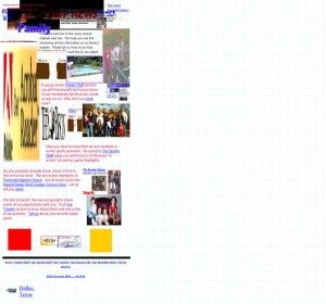
http://www.inflatablechurch.com/

You’re looking forward to your big day as a bride. Who do you choose to take care of the outfits for your big day? The site that looks like it was designed by borderline crazy person of course. Missing plugins? I must be missing the one that makes this site readable.
http://yvettesbridalformal.com/

Bright colours hurt the eyes, and godawful design that scares small children. I had to highlight the text just to read it. Under construction apparently, maybe the best option would be to knock it down and start again. If I were a part of Princeton Consultants, I think I’d consider litigation.
http://home.comcast.net/~dmaneyapanda/zugorific/personal2.html
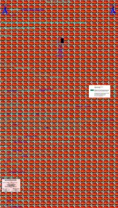
Broken links, and I’m not even sure what that is in the background. This site does partially redeem itself however by allowing the viewer to chose music, or not. Not I think.
http://ronoslund.com/

Lets see how many tables we can fit on a page. Oh look, that many.
http://www.huntgraphic.com/moto.htm

Perhaps not as offensive as the previous sites, this site definitely has been beaten with the ugly stick. I can’t believe they have the nerve to offer free backgrounds. That’s like Gordon Brown offering free PR advice.
http://members.tripod.com/fuzzymartian/

A big fat obnoxious site, with a monotonic robot voice. This page must have been designed by a former, disgruntled employee. Scrolling, flashing text and graphics actually made me have to take a break from researching this post.
http://www.esupersoft.com/lips/

If the appearance of this site means all officers are on the street protecting the citizens of West Virginia, rather than taking web design lessons, then it has my blessing.
http://www.martinsburgpd.org/

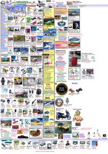
Never let so called ‘web conversion experts’ tell you that you shouldn’t put all of your products on one page. Why bother with layout, or indeed logic.
http://www.arngren.net/
Possibly not the worst site on the list, but hell, these guys are supposed to repair computers, not infect them with awful designs.
http://home.comcast.net/~computerphysicians/

This eyesore of a site at least has a nice dog picture- dogs win, web design loses.
http://frnz.de/

Jackson of Piccadilly does not fit in the ugly, flashy, boring or eye-popping categories. In fact, it is rather pretty. It has a lovely face, but no substance. Navigating this site made me want to reach for a coffee. I don’t even like coffee.
http://www.jacksonsofpiccadilly.co.uk/main.htm

As well as the wacky misspelling of the word “wizard” in the site’s name, this is a pretty gruesome site! Not the sort of design that would convince me that they’re the best people to stick a needle in my arm.
http://www.wizzardstattoo.com/

This guy actually does web design. In that case I’m a brain surgeon.
http://www.webking.com/computer-services/index.html

Does anyone have any idea what this site is even about? I really am at a loss.
http://bremen.weltregierung.org/abstraktindex.html
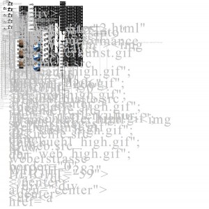
Someone thought that using a colour scheme based on a wounded zebra would be attractive.
http://www.izzza.com/

Maybe not typical of German efficiency and ingenuity, unless you count efficient as putting as many elements on the page as possible. Actually, maybe those crazy Germans have stumbled on something…….
http://www.ingenfeld.de/

A site of very few words. I guess they’re letting the pictures speak for themselves. I’m not sure why, but I feel a bit uncomfortable looking at this site. Maybe it’s becacuse I feel like I’m about to get run-over by those trucks.
http://www.mccormickrecovery.co.uk/

Yes, more frames, tables, bright colours, marquees, and flashing graphics – you’re spoiling us!
http://www.fabricland.co.uk/

This is actually Aaron Wall’s first site. I guess we all started off like this, myself included, mine just isn’t online anymore
http://www.newnavy.us/

The sparse wasteland of this site is perhaps only rivalled by the grusome design of their building, which they seem to be very proud of for some reason.
http://cbm-eureka.com/

Does this chiropractic site instill trust? I think a good rule to live by is if someone can’t sort out text justification then you probably shouldn’t let them play with your spine.
http://www.proactivechiropractic.org/

Source
Posted by , Published at 11:36 PM and have